Case Study (01) · Healthcare
Live Insights
Reporting Tool
A unified real-time analytics station for Contact center (950 operators), Enrollment teams & Claims operations team.
Case Study (01) · Healthcare
A unified real-time analytics station for Contact center (950 operators), Enrollment teams & Claims operations team.
Context
A leading BPO provider serving Medicare Advantage, Part D, and Managed Medicaid across 50 states needed to consolidate fragmented operations of contact center, enrollment and claim teams into a single real-time platform. I led UX from discovery through handoff.
Problem & Solution
Constraints & My Role
Impact
Rolled out to users who manages 32 health plans which serves 4.4M members nationwide — replacing manual spreadsheet reporting with a single real-time platform serving managers, executives and contact center agents.
Design Approach
With three audiences, four data systems, and 32 health plans pulling in different directions, the cost of getting the problem wrong was far higher than the cost of moving fast. I chose a structured double-diamond process to separate hearing what each audience needed from deciding what to build.
Research
I ran moderated online interviews directly with representatives across three audiences — agents, managers, and executives — and wrote scripts for BAs to execute shadowing sessions on the operations floor. The combination gave us both the reported experience and the observed workflow.
What users told me
Synthesis
Triangulating across the three audiences, the same four themes kept surfacing. These became the north stars the product had to address.
Give agents, managers, and executives access to live performance data — not delayed reports.
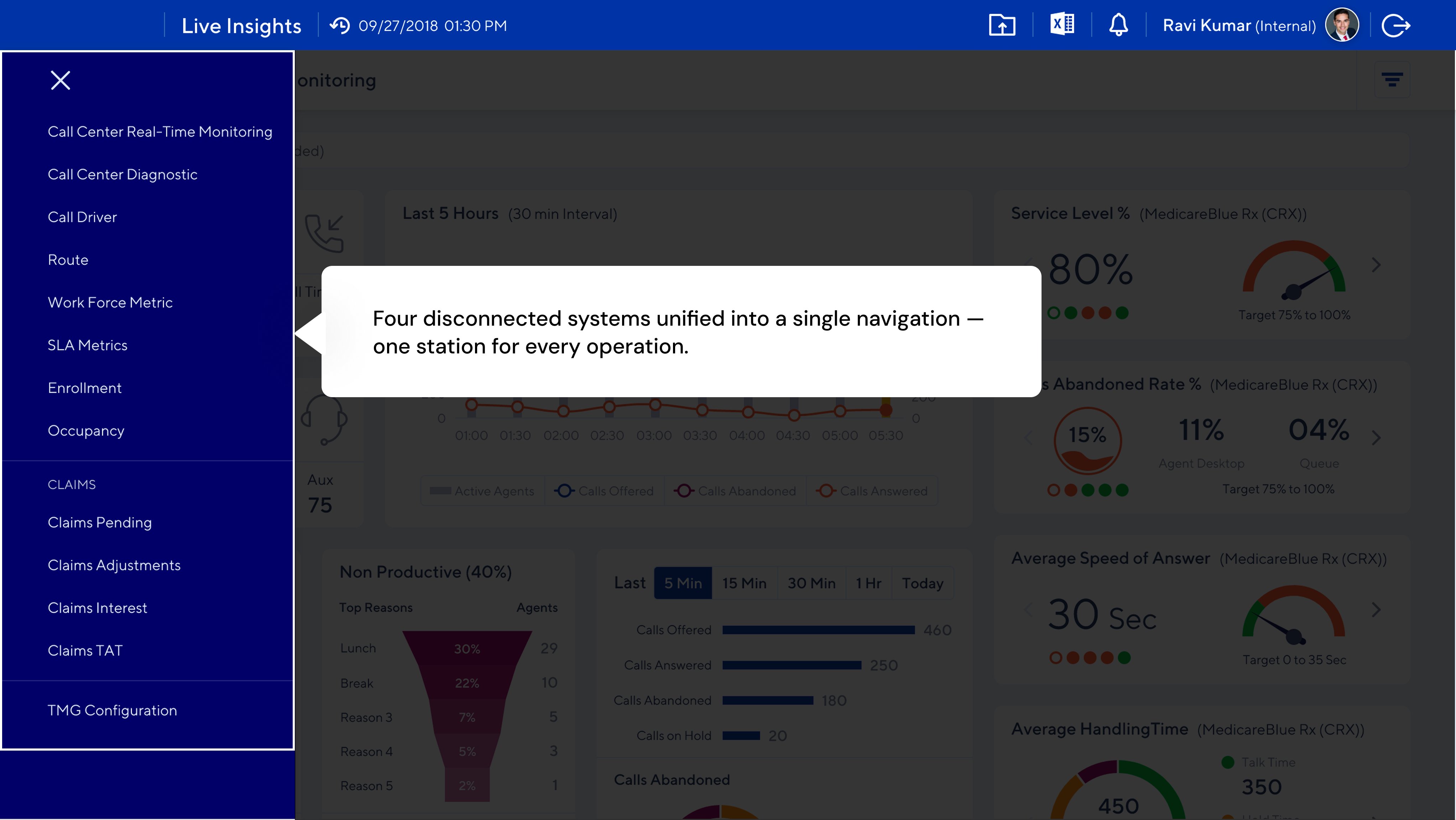
Replace four disconnected systems with one platform and reduce cognitive load.
Show where claims are in the pipeline so managers can identify bottlenecks and prioritize work.
Surface financial exposure signals so leadership can act before issues become costly.
Information Architecture
I used an impact-vs-frequency matrix to prioritize features, then grouped functionality into four modules aligned to how each audience worked — not how the underlying systems were organized.
Arriving at the Solution
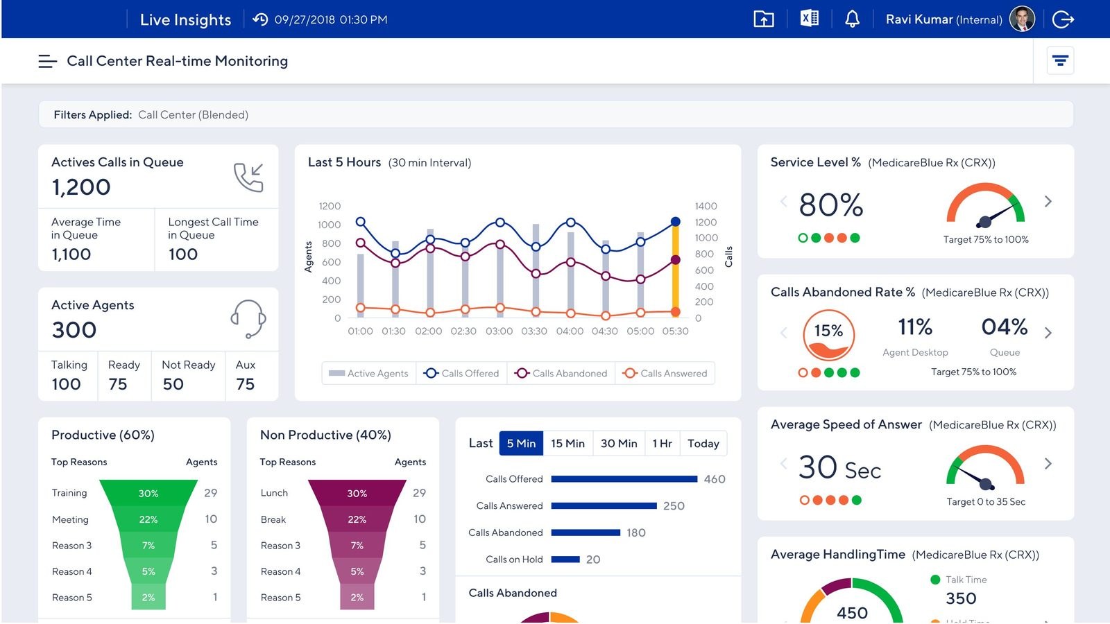
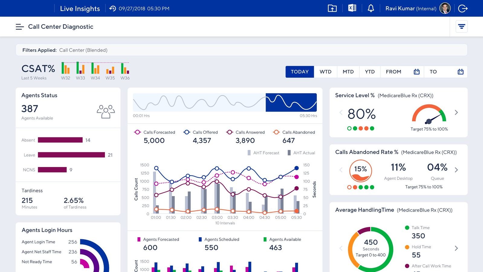
The floor view for managers. Live agent queue, call volume trends, service level vs. target, and productive vs. non-productive time — refreshed continuously.
The retrospective view. CSAT trends, forecasted vs. actual handling time, and period-over-period patterns — evidence for coaching and capacity planning.
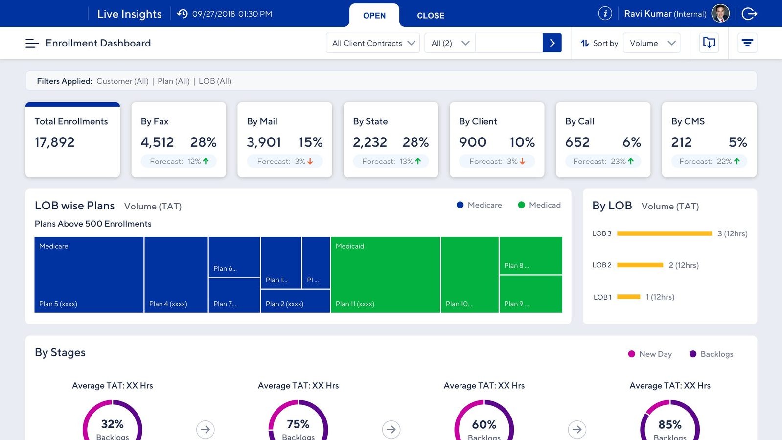
Channel-split view. Total enrollments by source, forecast deltas, and LOB-wise plan breakdowns tied to stage-level TAT.
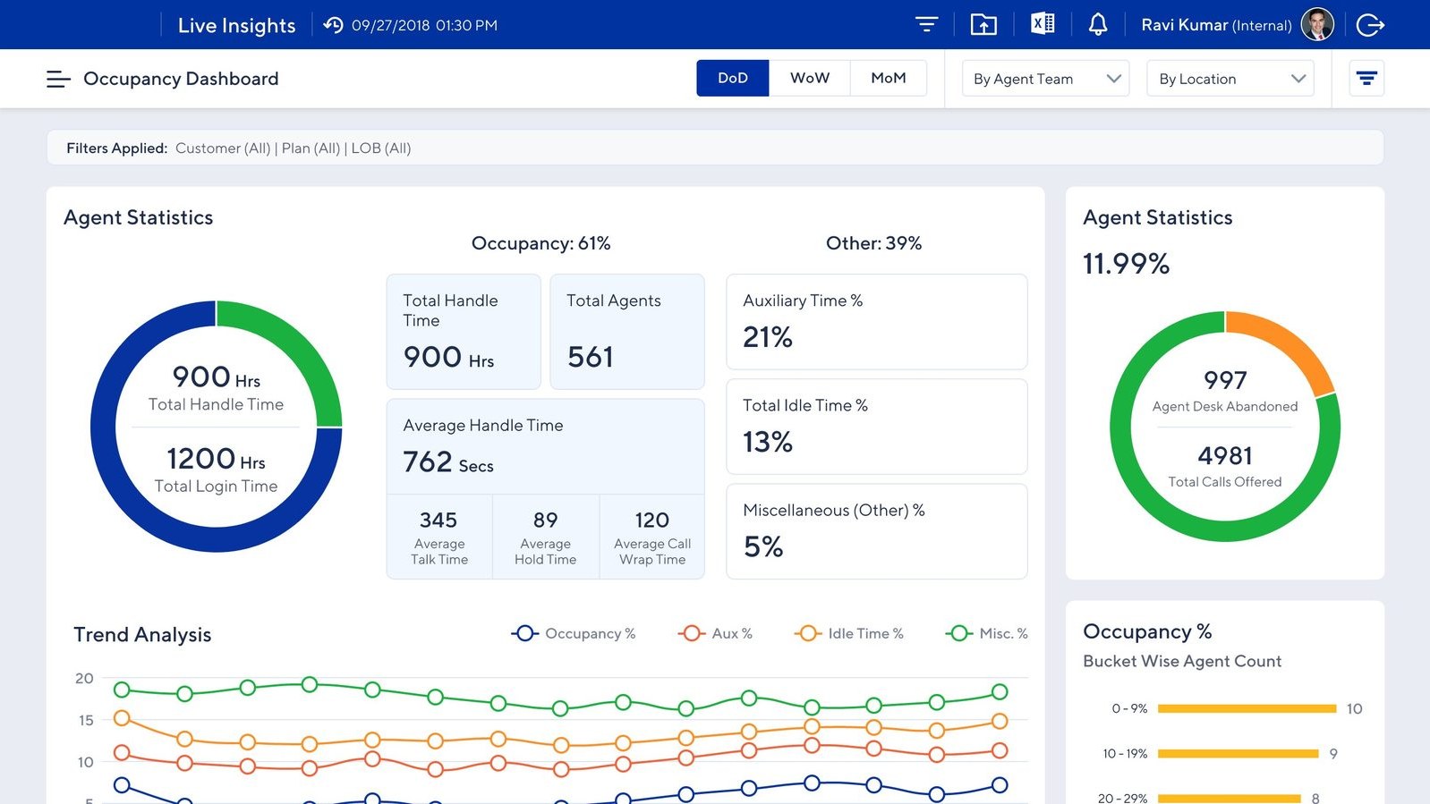
Utilization view. DoD, WoW, MoM occupancy with handle time, login time, and trend analysis for aux, idle, and misc time.
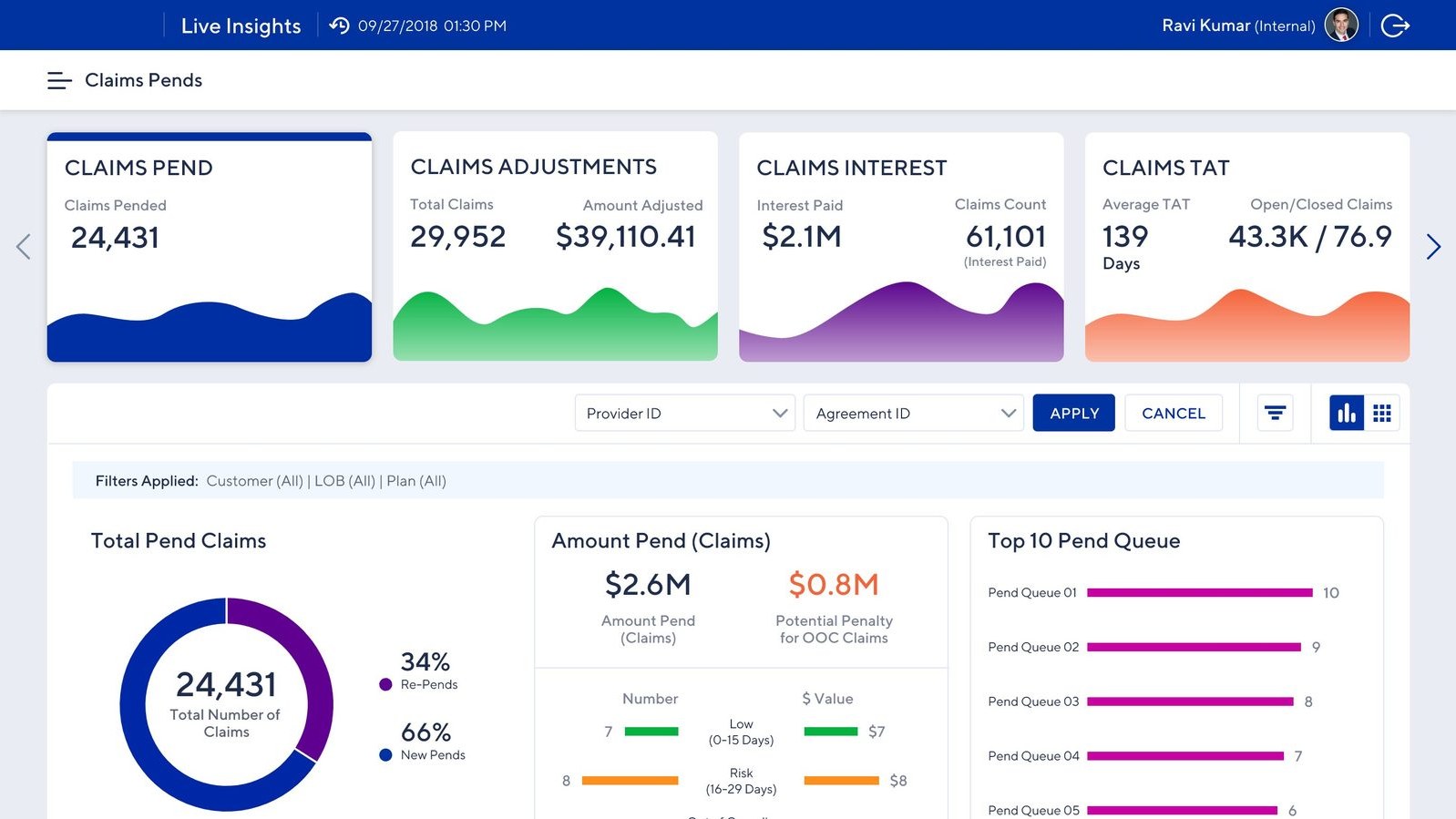
Financial exposure view. Pending volumes, adjustments, interest paid, and risk breakdowns with potential penalty for out-of-compliance claims and SLA breaches.
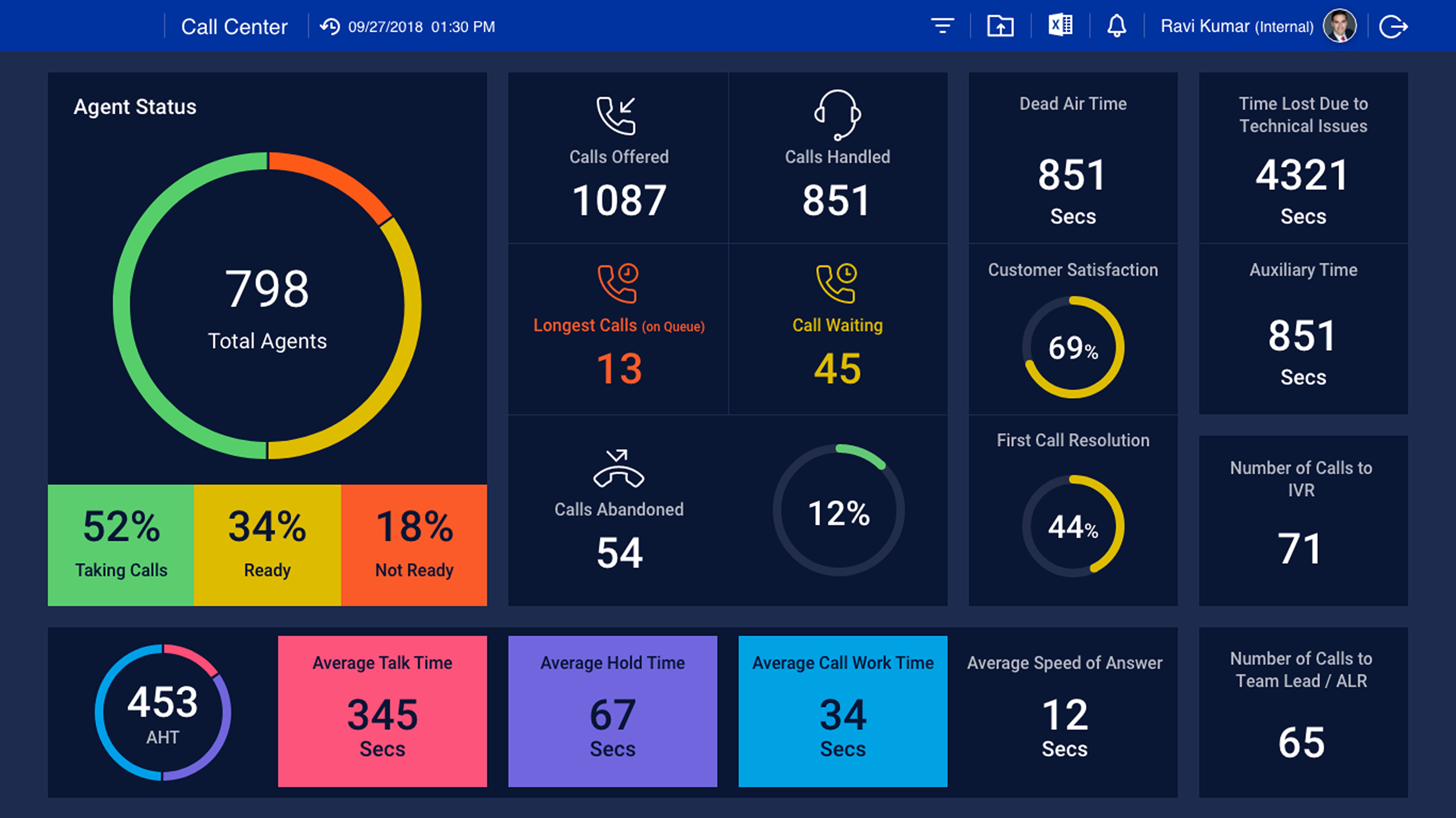
A wall-mounted dashboard for the call center floor itself. Designed to be read across a room: agent status at a glance, live queue and call activity, customer satisfaction, and team timing metrics. The platform’s second audience — the agents on the floor — got their own view of how their center was running, in real time, while they were running it.
Reflection
Challenges
Hardships I had to overcome
Different regions had different workflows and success metrics. I navigated this with structured workshops, a shared taxonomy, and an iterative release strategy where regional feedback informed future versions.
Both agents and managers were initially skeptical of automated reporting. I involved key users in co-design sessions, demonstrated quick wins early, and made the productivity gain visible from day one.
Agents needed task-level detail; executives needed high-level trends. A role-based experience with distinct views solved this — without fragmenting into three separate products.
Trade-offs
Deliberate design decisions
Pulling live data from four systems simultaneously created bottlenecks. I prioritized real-time refresh for operationally critical metrics (queue status, abandonment) and scheduled cycles for less time-sensitive data — keeping the platform fast without sacrificing what mattered most.
I pushed for actionable items inside the dashboard — letting managers reassign work, escalate, or trigger workflows directly from the metrics they were watching. The business agreed it would be valuable, but integrating across the underlying platforms required pulling in multiple technical teams and a budget no one wanted to commit to. We shipped read-only. I still think it was the right product decision and the wrong one for the user — managers ended up jumping back to legacy tools to act on what the dashboard told them.
Alongside the dashboard, I proposed sound cues for queue spikes and visual flags when individual or team metrics crossed thresholds. A good-to-have on paper, but a meaningful one for the actual users — the reps work overnight from contact centers in the Philippines, and a passive dashboard asks more attention from a tired night-shift worker than the design should. The feature was agreed-on but parked for a later release. We shipped a quiet dashboard. The agents who needed the help most got the version that helps least.
Takeaway
What I carry forward
Users skeptical of the platform's accuracy wouldn't act on it. Transparency around sourcing and calculation was as important as the design itself.
Building one platform for three audiences works — but only when every decision is anchored in a clear user mental model for each.
Getting 950 operators to change how they work isn't a training challenge. The tool's value has to be visible from the first login.