A unified learning platform for 250,000 Cognizant associates — consolidating fragmented tools, introducing AI-powered recommendations, and earning two Brandon Hall Group Gold awards for learning innovation.
ClientCognizant (internal)Enterprise L&D
My roleSenior UX DesignerLed team of 6
Timeframe8 monthsEnd-to-end delivery
ScopePlatform designResearch · IA · UI · DS
Context
A workforce of 250,000. A learning experience that was getting in their way.
Cognizant’s associates relied on a mix of legacy platforms to pursue upskilling, compliance training, and career development — each with different logins, different taxonomies, and different content catalogues. I led UX for the design of a single replacement platform, working with a team of two UX designers and four UI designers to deliver research, architecture, and a full component library that could scale to global rollout.
Problem & Solution
Problem
Each business vertical at Cognizant had its own learning portal — meaning associates could only see learning for their current department, with no easy way to explore skills outside their vertical. Most came only because training was mandated, not because it helped them grow. The result: low engagement, no sense of personal progress, and no mobile access to learn on the go.
Solution
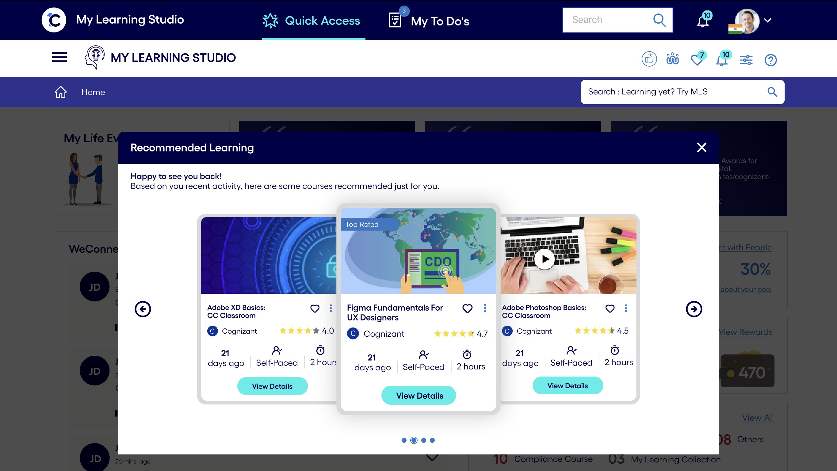
One consolidated platform that meets users where they are: AI-powered learning recommendations that cross department lines — so a developer could discover design thinking, or a tester could build toward a manager role — alongside curated learning paths, progress tracking, and an in-context chatbot for help. Designed mobile-first and integrated into the organization’s intranet portal, so learning fits into the day instead of interrupting it.
Constraints & My Role
What couldn’t change
Internal Cognizant ecosystem with strict L&D, SCORM, and compliance requirements.
Could not rebuild the underlying LMS — had to layer the new experience on top of legacy infrastructure.
Three audiences (learners, managers, L&D) with conflicting needs, one product.
My role
Owned: UX strategy, IA, design system, interaction design, leading a team of 6 (4 UI designers, 2 UX designers).
Did not own: visual branding (Cognizant’s existing system), backend architecture, content authoring.
Senior UX Designer leading end-to-end across an 8-month delivery.
Impact
250KAssociates served
30%Increase in self-initiated learning
2Brandon Hall Gold awards
5→1Portals consolidated into one platform
Rolled out across Cognizant’s global workforce, MLS consolidated multiple fragmented tools into one destination, reduced content discovery time via AI-driven suggestions, and was recognized with the Brandon Hall Group Gold for “Best Approach to Implementing an LXP” (2022) and “Best Use of Video for Learning” (2024).
Design Approach
Why a five-phase process, not a big-bang launch
A structured Design Thinking process where each decision had to earn its place before moving on — critical when designing for 250,000 users, where any wrong assumption would ship as the wrong product.
01
Empathize
Interviews, surveys, accessibility audits
02
Define
Personas, empathy map, journey map
03
Ideate
Sketches, flows, concept directions
04
Prototype
High-fidelity screens, design system
05
Test
Usability sessions, iterate on feedback
USER-CENTEREDITERATIVEVALIDATED
Research
Hearing the workforce before designing for them
I scoped and led the research phase myself, combining several methods to triangulate what associates actually needed. Interviews and user surveys with associates and managers across roles opened the conversation, and contextual inquiries let me observe how learning fit — or didn't fit — into their real workdays.
Alongside primary research, I ran a market analysis of platforms like Udemy and Coursera, and studied how peer IT organisations structured their learning functions. I paired this with internal usability evaluations of Cognizant’s existing tools — heuristic review plus direct observation of associates using them. Together, these findings became the raw material for synthesis.
Synthesis
Making sense of what we heard
My team and I translated research into three synthesis artifacts — personas to represent the audience, an empathy map to expose what the numbers couldn’t, and a user journey map to trace where the experience broke down. Together they surfaced the five opportunities we designed against.
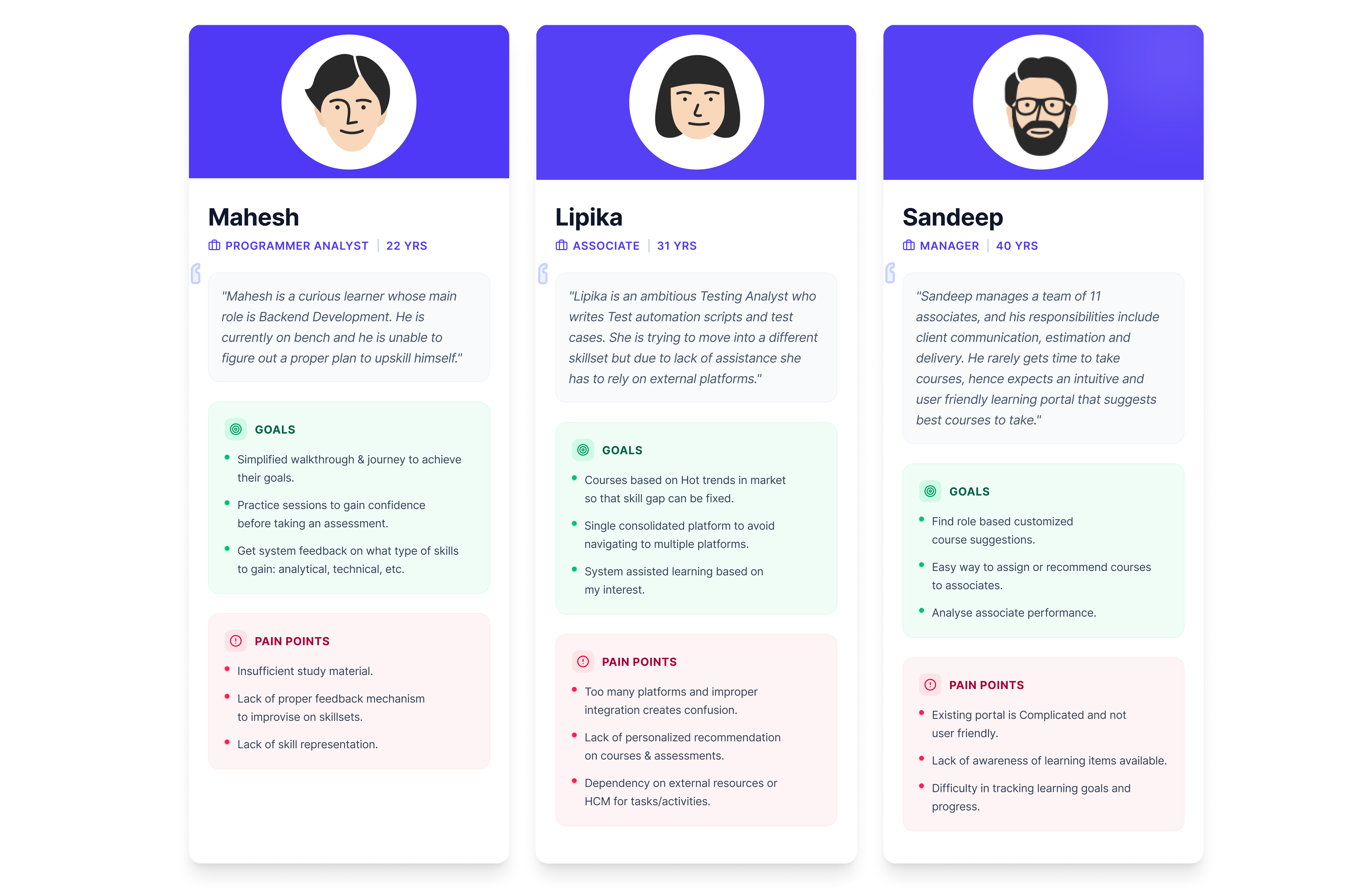
Personas
Three archetypes emerged from the interviews — Mahesh, an early-career programmer analyst finding his footing; Lipika, a testing analyst building toward a move into management; and Sandeep, a manager balancing his team's development against delivery pressure. Each carries distinct motivations, blockers, and learning rhythms that the platform would need to serve.
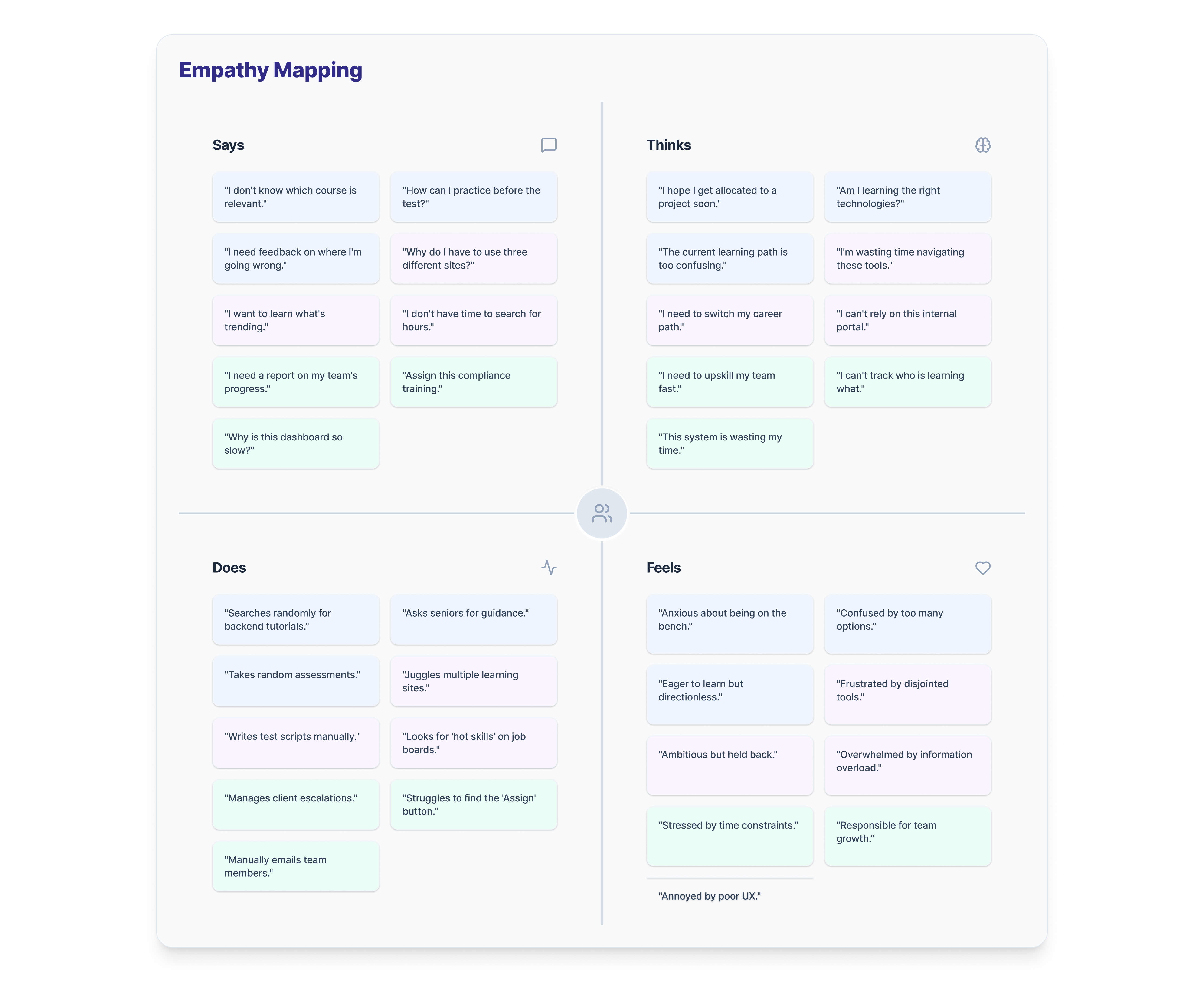
Empathy map
Mapping what associates said, thought, did, and felt about the existing platforms exposed a consistent gap between surface behaviour and underlying frustration. What sounded like benign feedback — "I'll get to it later" — was quietly signalling disengagement, avoidance, and a belief that the tools weren't built for them.
User journey map
Stitching individual associate stories into a single five-stage journey — Trigger, Search, Learn, Track, Contribute — made the breakdowns visible. Emotion dropped sharply after Trigger and never fully recovered, with the steepest pains clustering around fragmented search, forgotten knowledge, and invisible contributions. Each pain point mapped directly to a design opportunity on the row below.
User journey map — tracing the experience across five stages, with pain points and design opportunities at each.
Five opportunities identified
01
Build a one-stop learning platform
Associates were juggling different logins and taxonomies for self-paced, instructor-led, and compliance learning. Consolidating into a single destination would remove the friction of figuring out where to go.
02
Tailor the experience
Associates in different roles had different learning needs — a developer exploring design thinking, a tester building toward management. Recommendations shaped by role, skills, and peers’ preferences would make the platform feel made for each person, not built for the average.
03
Stimulate motivation
The existing platforms felt transactional. Feedback, recognition, and visible progress — delivered through gamification — could turn learning from an obligation into something worth returning to.
04
Meet users where they are
Associates wanted to learn in transit, during breaks, or away from their desks. A mobile-first responsive experience would unlock the small moments where learning actually happens.
05
Open the conversation
Questions went unanswered and knowledge stayed siloed. Community features — feeds, forums, and an in-context AI chatbot — would turn passive learners into active contributors.
Arriving at the Solution
Five interventions, one coherent platform
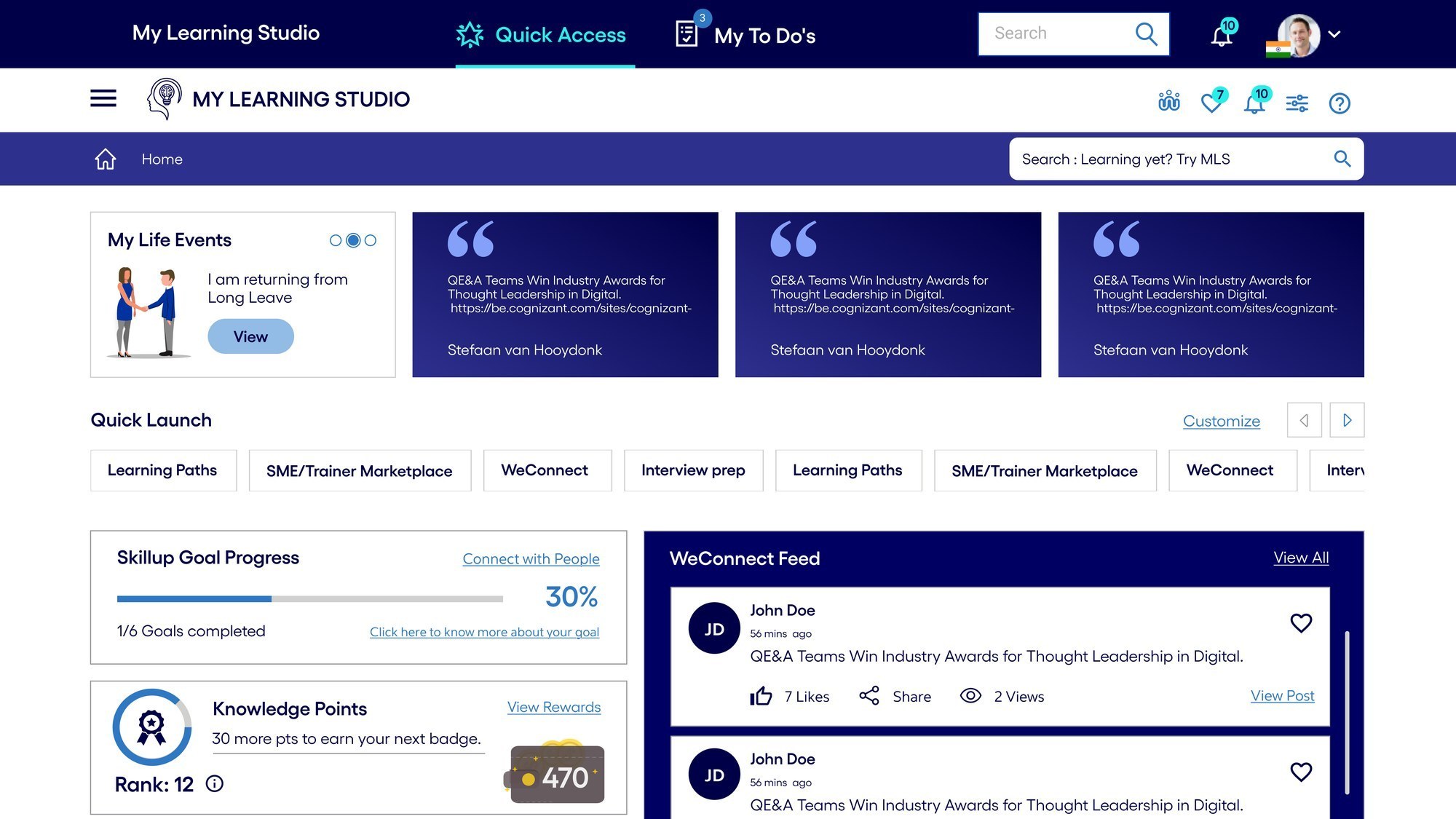
01 / Daily home
Intuitive & insightful dashboard
Learners and managers can now track progress, history, achievements, and team performance from a single dashboard. Learning goals sit alongside upcoming events, feed posts, and skill updates — surfaced proactively rather than buried in sub-menus.
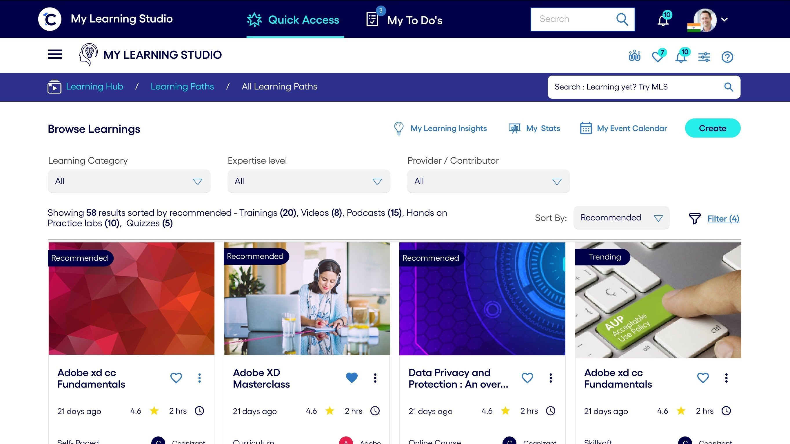
02 / Tailored discovery
Personalized learning
Course recommendations based on an associate’s skills, domain, and peers’ preferences. Courses sorted by “Recommended” and “Trending” surface relevance without requiring search, so users find what matters to them without hunting through catalogues.
03 / Intelligence layer
ML and AI for tailored recommendations
Machine learning powers content recommendations by reading skill gaps, role trajectories, and peer behavior. An AI chatbot surfaces in-context answers so users don’t have to leave the flow to find guidance. Both integrate into the existing OneC app ecosystem.
04 / Wayfinding
Improved navigation
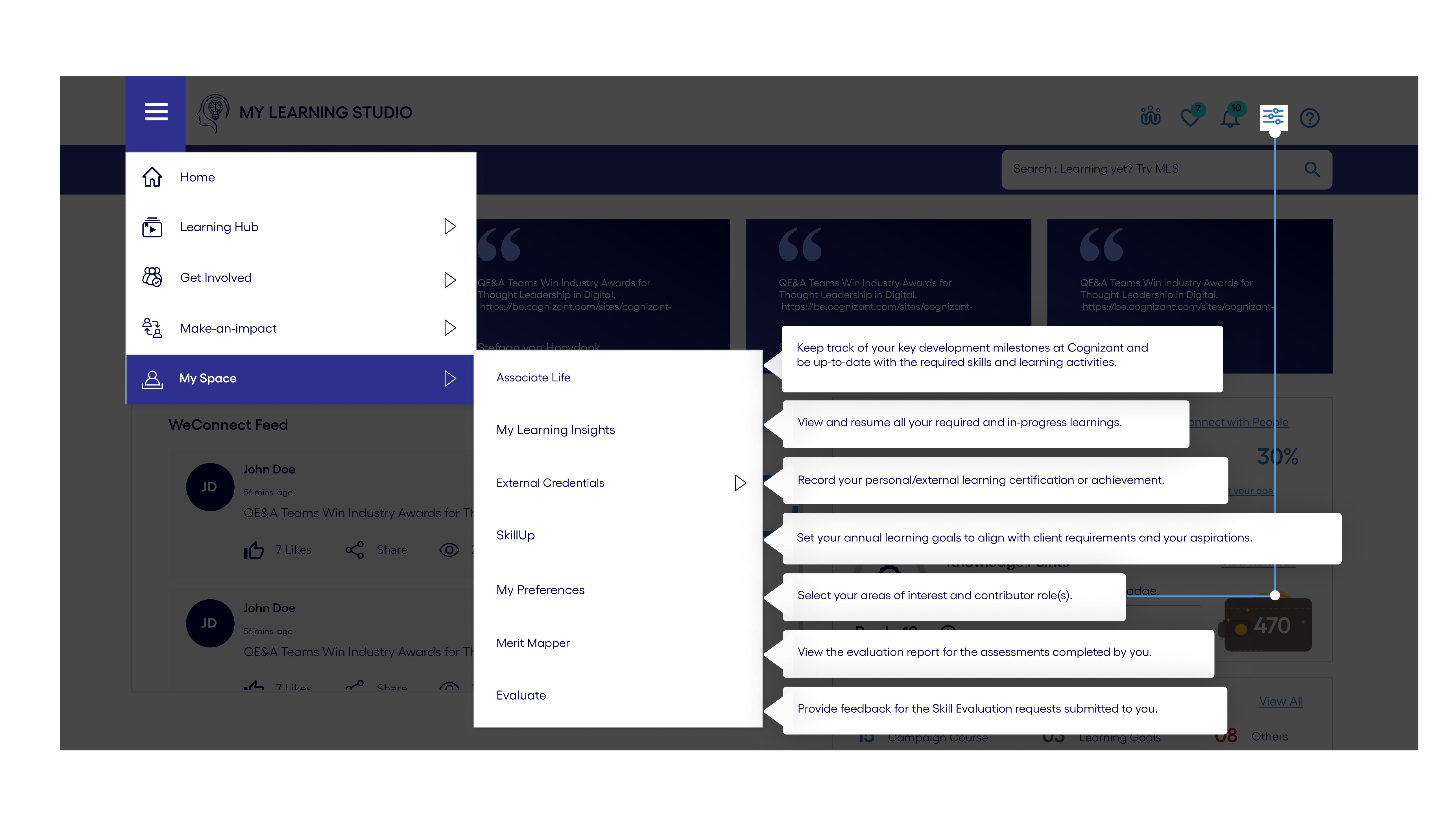
I ran card-sorting workshops with associates to refine the platform’s taxonomy from the ground up. The resulting navigation lets users move across Learning Hub, Get Involved, Make-an-impact, and My Space with clear mental models of where each action lives. A responsive experience preserves the full learning journey on mobile — browsing, practicing, tracking, and earning — since associates told us their learning happened in small moments, not long desktop sessions.
05 / Engagement loop
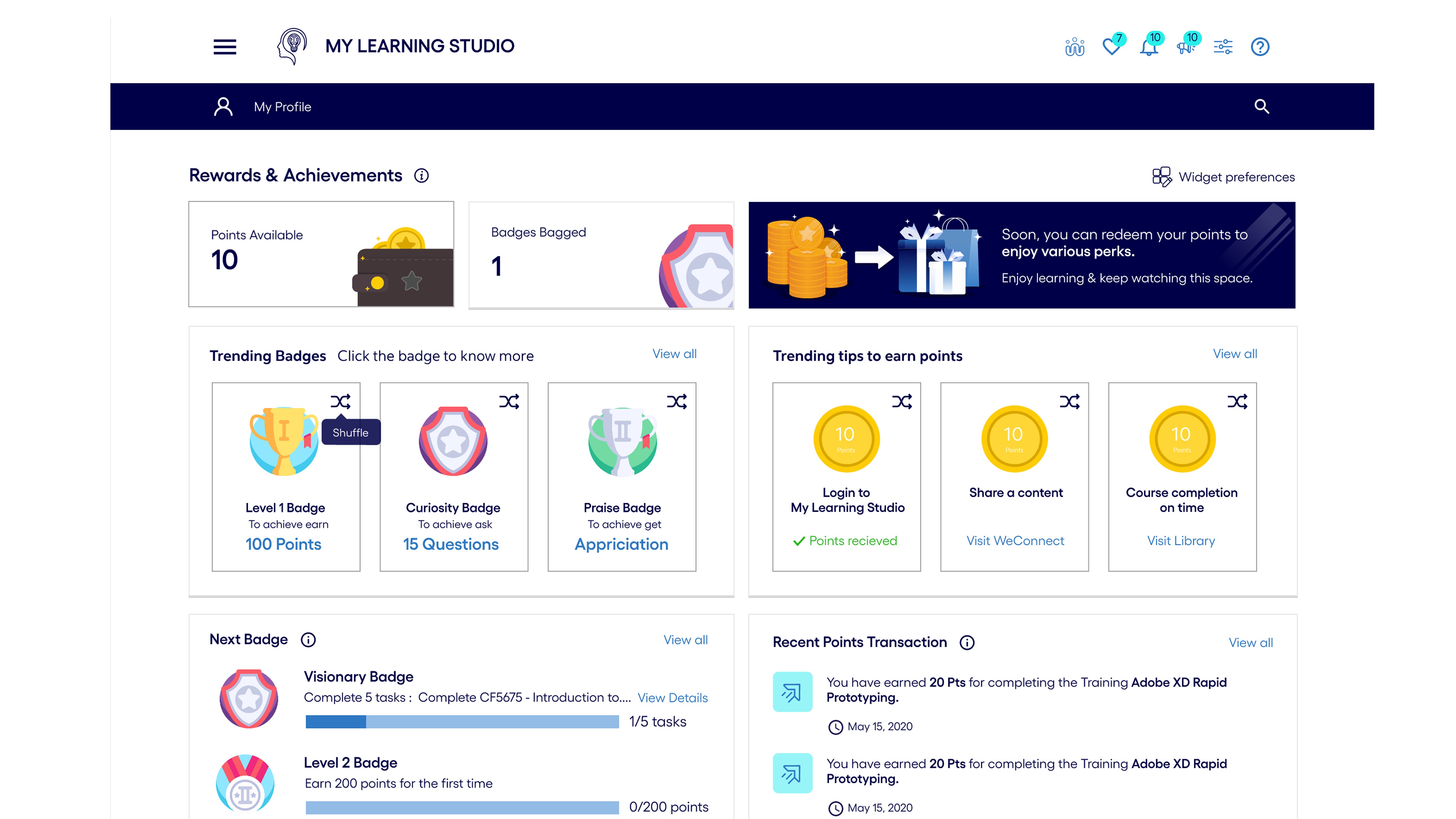
Gamification
Points, badges, a leaderboard, weekly streaks, and “next badge” progress turn learning from an obligation into something worth returning to. Managers can cheer team members; learners can see their trajectory.
Design System
Six designers, one source of truth
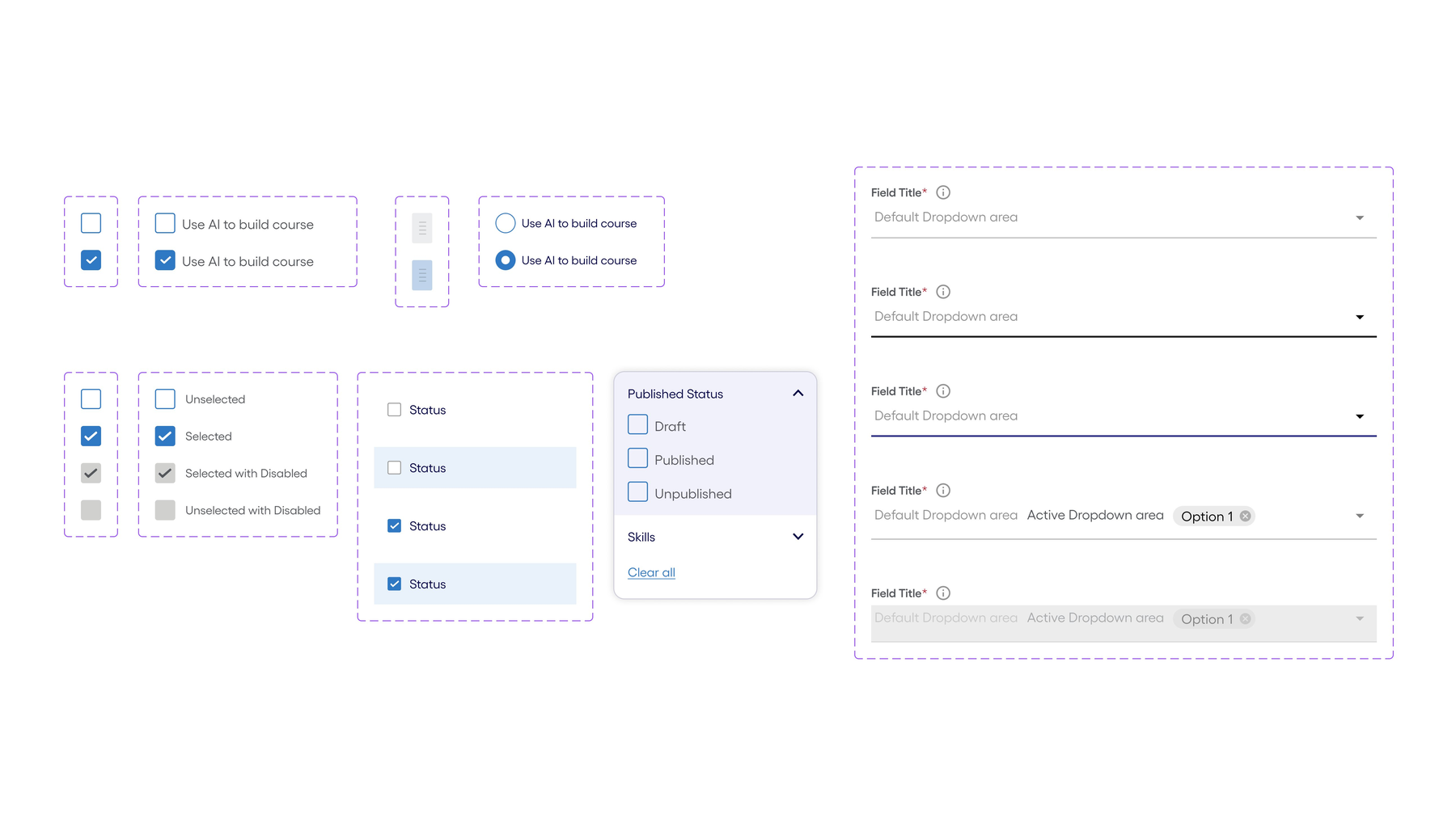
With four UI designers executing in parallel, consistency was at risk from day one. I established a component library and usage patterns early — covering form fields, dropdowns, checkboxes, states, and dialogue patterns — so that every screen shipped felt like part of the same product. This also shortened onboarding time when designers rotated in and out of the team.
Reflection
What this project taught me
Challenges
Hardships I had to overcome
01
Coordinating six designers without becoming a bottleneck
With four UI designers, two UX designers, and myself, decisions could easily stall waiting for my review. I shifted from gatekeeping to establishing clear design principles and component ownership — designers made decisions within guardrails, and I reviewed outcomes rather than approving each step.
02
Designing motivation, not just features
The biggest learning from research was that no feature would succeed if the platform still felt obligatory. I pushed the team to treat gamification, progress visibility, and positive feedback as first-class requirements rather than nice-to-haves.
03
Shipping one platform for three very different audiences
Early-career learners, mid-career switchers, and managers all had different mental models. Personalization and role-based defaults resolved this — every user got the same product, but what surfaced first reflected where they were in their journey.
Trade-offs
Deliberate design decisions
01
Consolidation vs. familiar workflows
Collapsing multiple platforms into one meant forcing long-time users to re-learn where their content lived. I prioritized a clean single taxonomy over preserving legacy patterns — and invested in onboarding and in-context help to smooth the transition.
02
AI suggestions vs. user control
Machine learning recommendations are only valuable if users trust them. I made sure recommendations were clearly labelled (“Recommended”, “Trending”) and kept manual search and browse paths fully available — AI accelerates, but never replaces, the learner’s own agency.
03
What got cut: the merit impact loop
I proposed a closed loop — associates learn a skill, apply it on real projects, lift their peers and earn client trust, and that trail of evidence flows directly into their appraisals, promotions, and increments. Learning would stop being a checkbox and become a career instrument. The business agreed in principle and put it on the back burner — the lift required HR systems, manager workflows, and policy changes that weren’t on the table at the time. We shipped the learning side without the appraisal hook. The gap is still where most of the platform’s potential lives.
Takeaway
What I carry forward
01
Leading design is a design problem of its own
Scaling design across six people required the same discipline as designing the product: clear principles, shared vocabulary, and visible progress. When those were in place, the team moved fast; when they weren’t, no amount of reviews could close the gap.
02
Engagement is never a feature; it’s a throughline
We didn’t “add” gamification or personalization — they had to shape every decision, from navigation depth to microcopy. The 30% lift in self-initiated learning came from that consistency, not from any single element.
03
Awards are a signal, not the destination
The Brandon Hall Gold wins validated the approach, but the real measure was that associates started using MLS voluntarily. That’s the metric I came back to every time a decision was contested.