Aptviz
Previous case study Next case study

Case Study (03) · Design Tooling

Aptviz
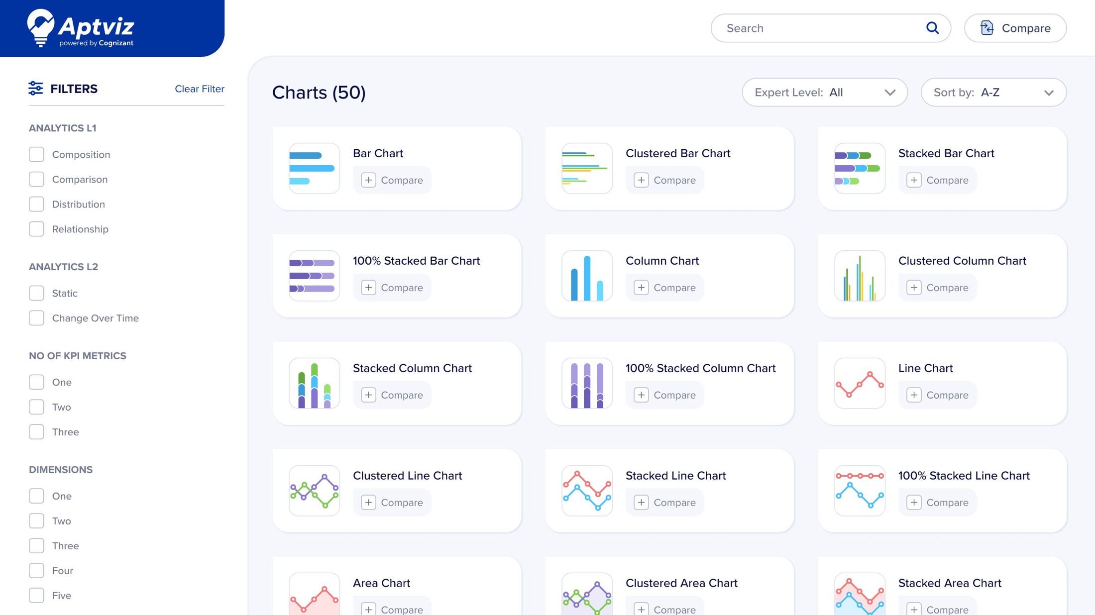
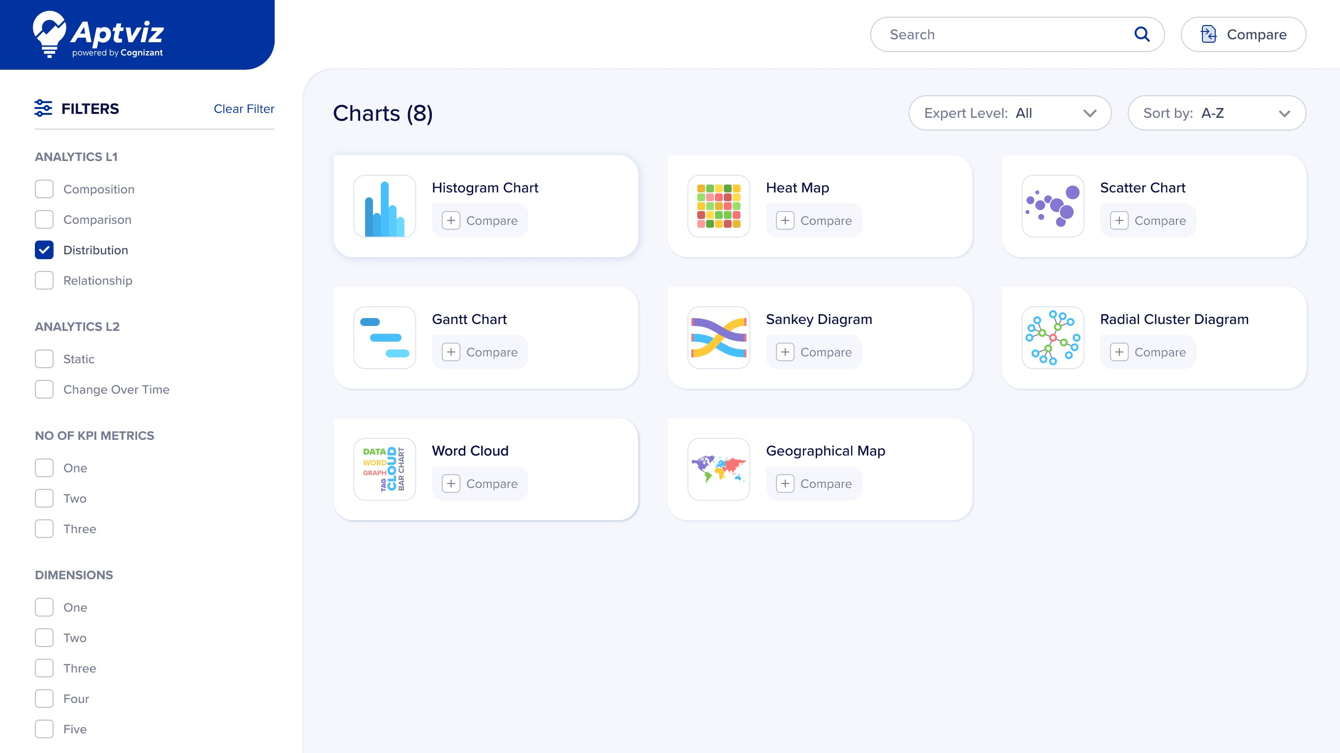
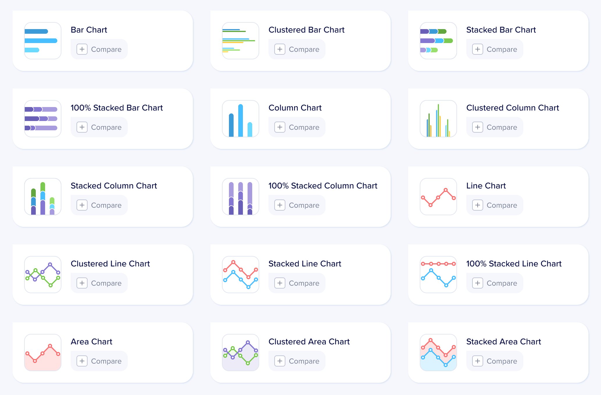
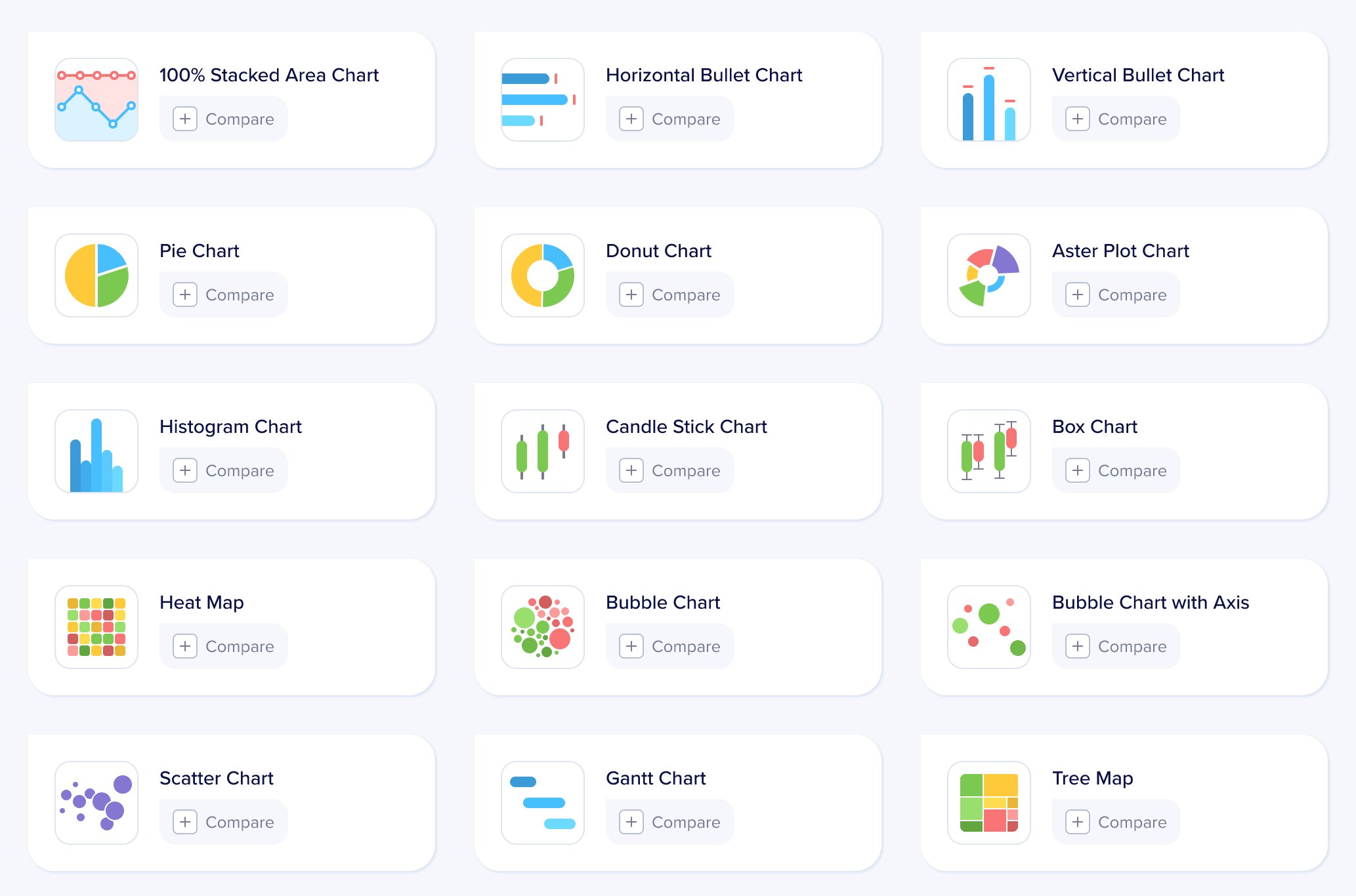
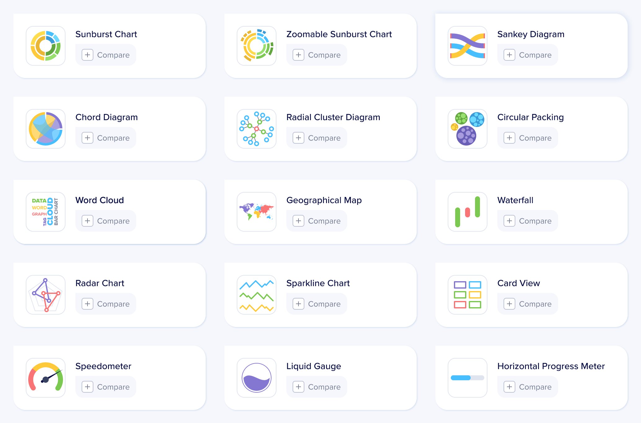
Right chart, right decision

An internal chart library and selection tool for Cognizant’s Center of Excellence — built to replace hours of trial-and-error with a confident, filtered short-list of the right visualization for the job.

Client Cognizant COE Internal design tool kit
My role UX Designer Research & implementation
Timeframe 6 months Shipped late 2020
Scope Research · IA · UI Component design · viz patterns
Aptviz tool interface showing the full chart library with 50 visualization options and the filter sidebar

Problem & Solution

Problem
  • Dashboard developers and designers spent disproportionate time figuring out which chart fit a given dataset.
  • Existing BI platforms assumed you already knew what to pick — fine for experts, breaking for everyone else.
  • The cost: trial-and-error, inconsistent visual outputs, and frequent rework across analytics projects.
Solution
  • An internal chart library that narrows 50+ visualizations down to a confident short-list.
  • Selection driven by four filters — type of analysis, temporal behaviour, metric count, and dimensional splits.
  • Saves design and development time across data visualization teams.

Constraints & My Role

What couldn’t change
  • Internal Cognizant tooling — no external chart library could replace it.
  • Had to coexist with existing Tableau and PowerBI workflows the COE already used.
  • Tight 6-month window from research to shipped tooling.
My role
  • Owned: research, IA, component design, the chart-selection logic, and end-to-end UX of the tool.
  • Did not own: visual branding (used Cognizant’s design system), chart engine implementation, backend.
  • UX Designer with full ownership of the design effort across discovery and shipping.

Impact

HrsMin Chart selection time
60% Time saved in exploration
4 Filters that replaced trial-and-error

Design Approach

Research, synthesis, framework

The work moved through three phases — researching what existing tools offered and what dashboard builders actually asked of their data, synthesizing the patterns into a small set of orthogonal filters, then turning that into a working framework Aptviz could be built around.

01 02 03 Research Synthesis Framework Audit BI tools & map analyses in the wild Distill recurring patterns across both studies Four orthogonal filters drive selection

Research · Feasibility Study

Multiple BI platforms, one recurring gap

Before designing anything, the team audited multiple major BI and analytics platforms to map what each offered and where they consistently fell short. Every platform had rich charting. None of them helped a dashboard builder decide which chart to use. Aptviz didn’t need to replace any of these tools; it needed to sit alongside them as a decision layer.

01 Tools and technology Every development tool has its own limitations 02 Power BI — observed behaviors What we found during the feasibility study Fixed navigation: dashboard → reports → drill-throughs No dynamic personalization by user or role Chart interactions are pre-defined; filters can’t drive navigation No dropdown selection controls Hierarchical drill-down works only with default chart types Cross-report navigation requires bookmarks
Tools audited against the constraints that kept them from functioning as a decision layer.

Research · Possibility Study

What dashboard builders actually ask of their data

03 Possible analyses with the available data Within the constraints of the tools evaluated Comparison Revenue across business units Ticket volume between departments Contribution Profit share across departments Breakdown of major business expenses Trend Share value across the last 8 quarters Ice-cream sales over the last 10 months Frequency Covid cases by age group Productivity by years of experience Ranking Top 10 countries affected by Covid Top 10 Indian companies by market value Correlation Sales value versus profit value Productivity versus employee benefits Variance Profit sits 5% below target Departmental sales versus targets Pareto Top 20% of customers drive 80% of profit 80% of ice-cream sales come from 20 countries
The analysis categories the tool had to support — the vocabulary the chart-selection logic was built around.

Synthesis · Framework

Chart selection is a four-filter problem

The breakthrough came when the team stopped asking “how do we categorize charts?” and started asking “what does someone building a dashboard actually know about their data before picking a chart?” The answer was four orthogonal things.

01 / INTENT Analytics L1 What story to tell? 02 / TEMPORAL Analytics L2 Does it change over time? 03 / METRICS KPI Metrics How many numbers? 04 / DIMENSIONS Dimensions How many splits? RECOMMENDED A filtered set of chart options Whats your analysis? Descriptive Predictive Diagnostic Prescriptive or or or - Composition - Static - Comparison - Change over time - One - Two - Three - One - Two - Three - Four - Distribution - Relationship

Four filters, one confident short-list — the logic that shaped the entire tool.

The Tool

60+ charts, one screen to choose

Aptviz is a single-screen tool by design. Filters, the chart grid, the compare action, and chart metadata all share one view — a dashboard builder should see their options side-by-side, not navigate between pages to reach them.

Aptviz default view — all 50 chart types visible, filters untouched
01 / Starting point

All 50 charts, one screen

The default view shows the full chart library with filters untouched — a builder’s starting point, designer or developer. Nothing hidden behind tabs or modals; the whole space of options is visible at once.

02 / In motion

One filter narrows the grid

A single filter applied — “Distribution” — collapses the grid from 50 charts to 8. The filter sidebar, the result count, and the narrowed chart set all stay on the same screen, so the builder watches the space of options shrink in real time.

Aptviz with Distribution filter applied, narrowing to 8 chart options

Chart Library

Sixty-plus charts, one visual system

Alongside the selection logic, the team designed the charts themselves — more than 60 components across bar, column, line, area, distribution, relationship, hierarchical, flow, geographical, and radial families — under a shared visual system so six charts pulled into one dashboard look like they were made by the same hand.

Reflection

A decision layer for dashboard work

Outcome

Aptviz shipped to Cognizant’s COE in late 2020 and became the internal reference for dashboard designers and developers building analytical experiences. The headline outcome: a 60% reduction in time spent exploring visualization options, replacing trial-and-error with a confident short-list in minutes.

Takeaway

Designing a tool for other dashboard builders — designers and developers alike — taught me something I carry into every project since: chart selection isn’t aesthetic, it’s a constraint-matching problem — and the constraints are usually already in front of you if you ask the right questions.

Roadmap

Built for Cognizant’s internal COE, Aptviz outgrew its origin — shipping as a market-level product used by designers and developers alike on enterprise analytics work.